Categories
Blog

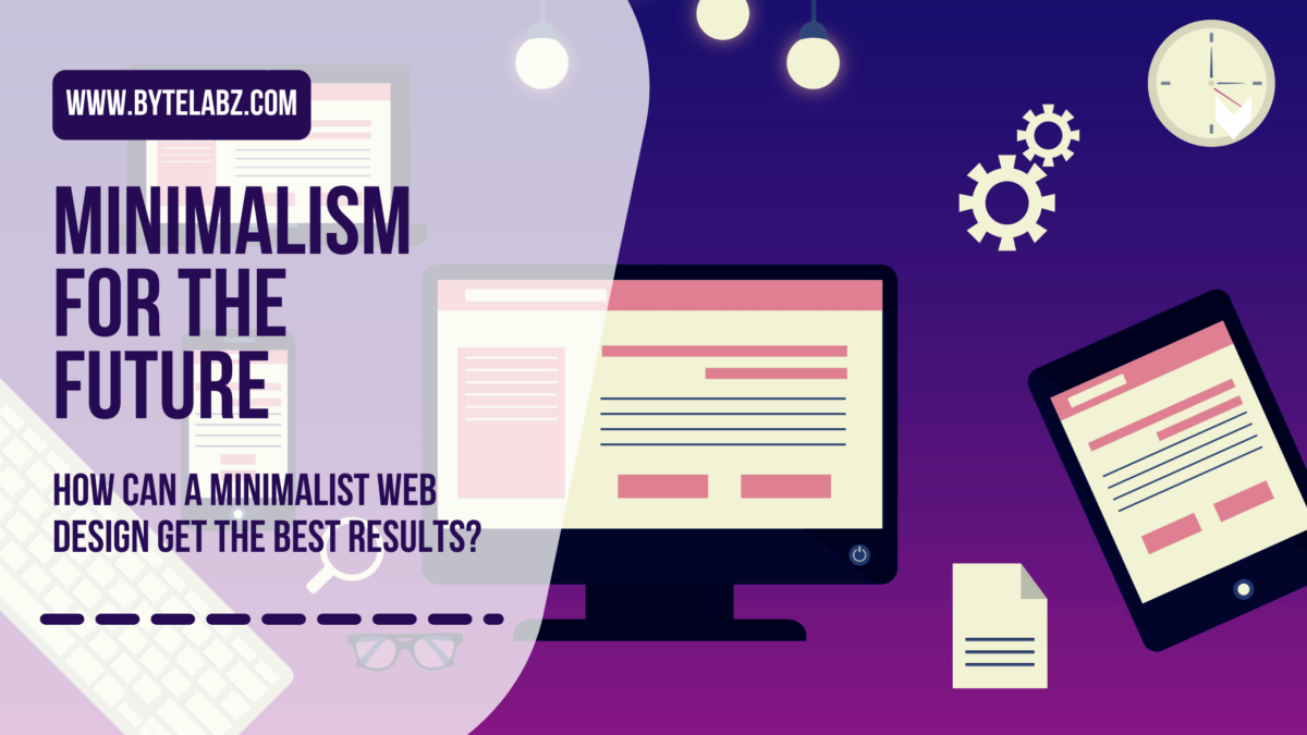
How Can A Minimalist Web Design Get The Best Results?

Business owners often struggle with figuring out the best ways to improve their company’s website, hence are always looking for innovative ways to do that. If you give it a thought, the answer might be simpler! To get your message across in an aesthetically pleasing manner, a minimalist web design is a simple and most effective way. The minimalist web concept is attracting many websites more than ever. One thing is clearly portrayed; the results of this golden invention are loved by most users. According to Review42.com, 38% of users exit a site if the design is unappealing. The demand for less clutter on websites has risen, since the first impression is vital. Most companies have started to desire a minimalist approach in web design. The various giveaway points for a minimalist web design are blank spaces, daring compositions, huge sharp images and distinction. The idea is to remove any unnecessary components thereby boosting essentialism. Minimalism first gained popularity in the arts during the 1960s period. The concept has gained popularity in web design since the beginning of web services. So, how come a minimalist web design has become more desirable than the others? If the amount of time it takes to create a website that looks great can actually make you feel like giving up (Yes! this can be very frustrating!), then check out the following. Here are the six proven reasons why a minimalist web design is giving an edge to your competitor and how you can improve that horizon. The idea of less is more is the psychology it chooses to elaborate.

Benefits of Minimalism in Web Design

The companies have realized in the post-pandemic era that most of their ideal consumers are one click away. The number of global internet users today stands at about 4.8 billion according to a recent survey report. Approximately 61% of the global human population is covered by internet access and usage. An average of 0.05s is required to adjudge your website by your target audience. This is all the time you have to make a lasting first impression as a business or brand. Below are the ways to get maximum leverage using a minimalist web design.

Minimalist Web Design Enables Maximum User Experience

Generally, the selling of ideas, products, services, or knowledge is the end goal of a web design wherein User experience (UX) plays a vital part that visitors have with your company through their digital transactions. This is the reason every year millions of dollars are spent by companies in the budget for user experience only. Webpages load faster when you have fewer elements on the website. Over 53 percent of mobile visitors exit a website when it’s loading time exceeds 3 seconds as claimed by a report done by Web Alive. Similarly, if the loading time of website is between one to three seconds bounce rate is expected to rise by 32 percent. Retention is built when visitors feel convinced to keep looking. In case of an awful experience 88% of visitors on a website fail to return as per the analysis by Website Builder. Too many pop-ups, disorganization and clutter on a website can result in this. The clients end up loving the interaction with minimalist web designs as they visually hook and guide the clients. Such a website seems to give the visitors an impression that it is solving their needs without demanding too much from them. Hence, such a website will end up having higher inquiries, recalls, references, conversions, and sales.

Easier to Navigate the Website

The focus of the visitor is redirected to the content in a clean and clear layout which is the result of fewer disruptions. As the users can easily find what they want or what the website has in store for them, it results in cutting the time taken to reach the website goal. A concise and compelling call to action along with few on-page choices are what a minimalist web design should have in order to fulfill its purpose. As the visitors are in a hurry, hence you need to get to the catch and hook them in no time, thinking just like in a conventional salesmanship. Here, once you just feed the visitors a solution to their curiosity just milliseconds prior, you are already one step ahead of your competitors. In a minimalist web design the organization of structure and content is crucial. For the ease of accessibility and readability, you will spot most of them having the menu, usually on the blank space. The information about product descriptions, rates, location, and contacts could be found in the menu. An on-page contrast is created by the use of fewer colors and striking images. Using this way, locating items on the website becomes easier for the viewers When compared to text a visual content can be 60,000 times quicker to process, as claimed by Wyzowl. The Minimalist web designers utilize this golden information by paying attention to both but focusing more on the former. It becomes easy for clients and visitors to scheme through the website’s content when there is readability. Fortunately for them, they can effortlessly find information when there is not much to see.

Your Company Appears Professional with A Clean Website

A noble web page can hook up many users. The design is responsible for 94% of all initial impressions on a website according to a report by WebFX. The crisp and large images, large typography and color-codes are some of the elements which add to it. In web design, for instance, the use of neutral color pallets has proven to work wonders. The decrease in visual noise brings the focus to the layout and structure. The brand is planned out and can deliver is the general impression that a user gets out of this. In order to draw in the attention of visitors unique, large, high-quality images against whitespace are used. The webpage looks edgy and inviting if large typography is tied well with the pictures. The curiosity about what more you have to offer is created in the minds of visitors. You must be careful that the clients are more likely to doubt your capabilities if they sense giddiness in your website. A report by SAGipl is a perfect proof of this situation. As per the report, if a website looks sloppy and unappealing, it can lead to over 38% of users quitting the site.

Cross-Device Compatibility

A website when opened using a desktop will often be responsive but will not give the same results on mobile devices. Around 73% of web designers believe that most users exit a website due to its non-responsiveness as claimed by a report done by GoodFirms. Website responsiveness is what most minimalist web designs capitalize on. Even with fewer visual elements, the designers ensure that everything loads and appears perfect even on small screens. People use their mobile devices for an average of 7 hours per day, in 2021. Thanks to a recent Google study, 48% of visitors get upset when a website fails to be mobile-responsive. Businesses record losses if users have a hard time navigating your website on mobile devices.

Timelessness in Style and Ease of Maintenance

Frequently altering their designs is something most great websites shy away from. You have two options if your web design gets distasteful after a season. One is to keep changing the web design and risk losing credibility and the other is to stick to the one you don’t like. The different web design trends, can seem fancy, while hopping onto trends but it ultimately can cost you. Since clients use colors and patterns to recognize you, a company’s brand identity is usually tied to their design. Some sort of confusion is sure to arise if they attached you with a blue background with white hues and you change it. A minimalist web design getting outdated has little to no chance in the industry. A fulfilling simple outlook requires web designers do a lot to maintain it. The idea and experience remain unparalleled even as time changes. A minimalist web design maintenance is generally easy since there are fewer updates needed. For the site to crash altogether or for visitors to get 404 errors is a rarity. There is no dreading on the possibility of the fleetingness of events this way hence web administrators can focus on other tasks.

Higher Google Rankings and Desirable User Interactions

It helps search engine bots to crawl a page with minimalist web design faster by having fewer visual elements on the website. These website rank higher on Google as a result. Around 75% of users never get beyond Google’s first page during search queries according to Hubspot. If your website does not make this cut this means that you are doomed. Faster loading speed on pages reduces bounce rates and increases user interaction and consumption. Most users can see and interact with the content on the website immediately after they land on it since the few visual elements load quicker. They can help in boosting rankings on Google by visiting other pages on the site while recording a desirable and satisfactory user experience. More than the invites, a cluttered web design ends up confusing and repelling visitors. Even before they could get a feel of what you offer, instead it results in prompting clients to leave. Poor visibility resulting from poor rankings will record poor sales and more losses for such a website.

Summary

Thanks to its numerous benefits, minimalist web design is here to stay. Although, it benefits to have the intent and end game in mind, while it may seem like the cool thing to do. Your efforts may be dampened by blindly adopting trends and styles. Minimalist web design has few drawbacks. It might look incomplete in the eyes of some users. It also has restricted room for progression by its seemingly limited communication. There can also be a perception of the brand being unserious. You should have the following questions in mind before deciding on going minimal: • Will the visitors find it easier to navigate my site? • Am I communicating with my target-user? • Does the design communicate to them? • Are users going to appreciate the design? • Is this relevant to my brand? Minimalist design is in the future of websites, despite having a few drawbacks. The results that come with a minimalist web design approach are unmatched, whether you are looking to design a website or revamp an already existing one. Bring your vision and needs to life by finding a design expert who can provide you fine results.
Categories
Blog

Top CSS Frameworks For Webdesigners

During the early days developing a website was hard stuff. It used to take long hours and lots of hard work. Web designers need to write more than 100 lines of codes for a single page. But now things have changed. Technologies are developing rapidly so everything is simple and time-saving. CSS frameworks emerged over time and took most of the struggles away.

Today web designers can’t imagine coding without their favorite CSS framework. With the help of CSS framework, they can easily create code and it’s saving their valuable time. Currently, there are wide ranges of frameworks available in the tech world and new ones are emerging. It’s difficult to choose a framework among them.

But how do you know which framework is suited for you? And how could you select a proper framework for your design?

First, you should understand about CSS framework and what responsive CSS frameworks do.

What is a CSS framework??

Wikipedia says that “A CSS framework is a software framework that is meant to allow for easier, more standards-compliant web design using the Cascading Style Sheets language

We create applications to lessen our tasks hence the framework is built so that we code less. The main advantage of CSS framework is even a beginner can develop a website faster as it requires minimal coding skills and comes with many useful widgets. This type of framework not only helps non-skilled people but it also helps skilled people. Skilled people can save their time and they can build a website faster. A CSS framework that supports responsive web design will save you valuable time and you will be able to develop within a time range.

In order to build a website, many bypaths seem available for any designer and developer. Frameworks are enhancing the designing process which will in turn speed up the entire process. A CSS framework is said to be the one which focuses on delivering a package made of the back-end, structured and standardized scripts like HTML5, CSS, and JavaScript. This is often mentioned as a front-end framework. Their main aim is to assist people in structuring their pages. In this way, you save your time from cumbersome coding and you don’t have to redo the code from scratch every time.

A CSS Framework means to provide ease in the process of web designing. This speeds up the entire process of website designing.

In this article, I’m going to discuss the pros and cons of the top CSS framework. You can select the right CSS framework and complete your website development quickly.

Bootstrap 4
It is one of the most favorite CSS framework used today. The world’s most popular front-end component library was developed by Mark Otto and Jacob Thornton. This open-source tool kit is developing with HTML, CSS and JS. Using this popular framework we can build web applications, websites and even mobile apps. Bootstrap is a responsive CSS framework it contains components and utilities including Sass variables and mixings, responsive grid system, flexbox, carousels, and models.

Pros:-
  • It’s consistent and appealing UI, out-of-the-box.
  • Provides lots of free and premium themes, templates and plugins.
  • Supported by all the major browsers.
  • It easily fixes CSS compatibility issues.
  • It is easy to learn.
Cons:-
  • It requires a lot of rewriting of CSS file if you want to customize and get diverted from the structure of this framework.
  • Its complex style leads to heaps of not so semantic HTML output.
  • The JavaScript in Bootstrap is connected to jQuery.

Foundation
Another responsive front end framework is the Foundation. This responsive CSS framework helps in developing and designing beautiful and attractive websites.  Foundation is developed and maintained by ZURB. Bootstrap and Foundation are the most-used frameworks currently in existence. It is written in HTML, CSS, Sass, and JavaScript. It’s currently on version 6 and comes feature-packed with a ton of components. Foundation is mostly used with websites, however, it also offers versions of the framework which is optimized for email templates and application development.

Pros:-

  • Simple UI and more straight-forward design than other options.
  • No needs to define heights and widths because the foundation uses REMs by default.
  • It is built for a mobile-first approach.
  • Very clean markup without sacrificing the utility and speed.
  • Offers services for site’s apps and emails.

Cons:-

  • It is difficult to use for beginners they should have prior experience with vanilla CSS or other frameworks.
  • Design elements are not attractive.
  • Less popular compared to Bootstrap.
  • Lack of wider support like QA sites and forums for fixing issues.

Bulma
Bulma is a free, open-source CSS framework based on Flexbox. This stylish CSS framework is made by Jeremy Thomas. One of the main benefits of Bluma framework is it is purely CSS that means no javascript. Its box model is fully based on flexbox. So designers can easily add flexible layout with same-size columns is as simple as adding column class to your HTML element. The framework is lightweight and uses the mobile-first approach, so it’s optimized for vertical reading.

Pros:-

  • It is purely CSS, no javascript.
  • It is a flexbox based framework.
  • Fully responsive and mobile-first approach.
  • Clean form controls out of the box.
  • Tiles and layout options are extensive.
  • No bloating of code and styles.

Cons:-

  • Small online support community – However this is growing by the day.
  • Not as component-rich as some other frameworks.

Tailwind CSS
Tailwind CSS is a highly customizable and low-level CSS framework. It is different from other frameworks. This UI framework doesn’t have any default theme and built-in UI. Instead of opinionated predesigned components, Tailwind provides low-level utility classes that let you build completely custom designs without ever leaving your HTML.

Pros:-

  • Highly Customizable.
  • It makes CSS simple.
  • It provides more flexibility.

Cons:-

  • It’s just in alpha stage.
  • Lack of wider support in the community.

Semantic UI
Semantic-UI is the lightweight, simple and responsive framework. Semantic UI is packaged with more than 20 themes with a range of JS, CSS and font files. Since pages are built through a semantic method it means that designs can look great and feature a range of components and settings to use.

Pros:-

  • Semantic-UI offers many more personalization options.
  • The framework is much easier to use.
  • Semantic UI provides the ability to load specific components in the application as per needs and it reduces the file size as well as load time.

Cons:-

  • It uses Javascript customization and so it can be challenging to execute custom workaround of the framework as per needs.
  • The packages used in Semantic- UI are much bigger in size so a web developer one may need to use only specific modules of Semantic- UI.

Materialize CSS

Material UI is a responsive CSS framework which is rapidly growing in popularity among the website and app development communities. Materialize framework is basically built on google’s material design concept. They use classic principles of successful design along with new innovation and technology for building this framework. Using this framework we can create attractive, consistent and functional web pages and web apps.  Material-UI is perfect for designing user interfaces and dashboards. This UI is part of the React framework which is a front-end Javascript framework made for UI design.

Pros:-

  • Flexible capabilities
  • Attractive design out-of-the-box
  • Speeds up development as it offers default stylings
  • Utilizes the latest material design standards from Google
  • A large variety of components

Cons:-

  • Not a framework for beginners
  • Requires knowledge of React JS and JavaScript to implement

UIKit

UIKit is a lesser-known responsive CSS framework. it is one of the most powerful CSS frameworks. Overall, it offers a streamlined, modern look yet still packs a punch. Out of the box, it’s a lightweight and intuitive framework. This framework is perfect for beginners to advanced users. Currently, in version 3, UIKit offers a ton of valuable components out of the box including Grids, Modals, Off-Canvas, Slideshows, Scrollspy, Parallax, Flexbox, Animations and more.

Pros:-

  • Attractive modern design out of the box.
  • Huge variety of components.
  • Components won’t affect other styles.
  • Fast prototyping.

Cons:-

  • Great documentation, but more suited to experienced web designers.
  • Limited online support community.

All the framework mentioned here is the best. Different CSS framework brings different benefits. Each one has it’s own pros and cons. Bootstrap is best for beginner and UIKIT is for professionals who want to improve their skills. Choose the CSS framework based on your skill level and requirement of your website.