


Leveraging HTML Picture Element for Responsive Images
In the ever-evolving landscape of web development, creating responsive websites that cater to a variety of devices and screen sizes is crucial. One key aspect of responsiveness is optimizing images for different devices to ensure fast loading times and a visually appealing experience. In this blog post, we will delve into how you can use the HTML ‘<picture>’ element along with ‘<source>’ elements to define different image sources based on the device’s characteristics.
What makes an image responsive?
Responsive images are images on a website that are designed to adapt and display appropriately on different devices and screen sizes. With the increasing variety of devices such as smartphones, tablets, laptops, and desktop computers, it is important to ensure that images are optimized for each device to provide the best user experience.
Responsive images can be implemented using techniques such as using CSS to set the image size based on the screen width, using the HTML `<picture>` element with ‘<source>’ elements to provide different image sources for different screen sizes, or using media queries to load different images based on the device’s characteristics.
By using responsive images, web developers can ensure that images are displayed correctly and efficiently across various devices, improving the overall usability and performance of the website. This helps in creating a seamless and visually appealing experience for users, regardless of the device they are using to access the website.
Responsive images are important for several reasons:
- Improved User Experience: Responsive images ensure that images on a website or web application look good and are properly displayed on devices with different screen sizes and resolutions. This helps provide a better user experience for visitors, regardless of the device they are using.
- Faster Loading Times: By serving appropriately sized images based on the device’s screen size and resolution, responsive images can help reduce loading times and improve website performance. This is crucial for optimizing the user experience and SEO rankings.
- Bandwidth Efficiency: Serving images that are optimized for the device’s screen size and resolution helps reduce the amount of data transferred between the server and the user’s device. This can be especially important for users on limited data plans or slower internet connections.
- SEO Benefits: Search engines like Google consider page load speed and mobile-friendliness as ranking factors. By using responsive images, you can improve your website’s performance on mobile devices, which can positively impact your search engine rankings.
- Future-Proofing: Responsive pictures are crucial to maintaining the accessibility and visual appeal of your website across a range of platforms, given the wide range of devices and screen sizes that are now in use. It is possible to future-proof your website and make it compatible with emerging technology by using responsive design concepts.
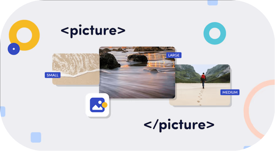
Understanding the ‘<picture>’ Element
The ‘<picture>’ element is a versatile tool that allows web developers to provide multiple sources for an image based on different criteria such as screen size, resolution, or even color depth. This element offers a more robust solution compared to the traditional ‘<img>’ tag when it comes to delivering optimized images across various devices.
To use the HTML ‘<picture>’ element to define different source images based on device conditions, you can follow these steps:
- Structure your HTML: Start by structuring your HTML code with the ‘<picture>’ element and the ‘<source>’ elements inside it. You can also include an ‘<img>’ element as a fallback for browsers that do not support the ‘<picture>’ element.
- Define Media Queries: Use the ‘media’ attribute within the `<source>` elements to define media queries that target specific device conditions, such as screen width, resolution, or device orientation.
- Specify Image Sources: Within the ‘<source>‘ elements, use the ‘srcset‘ attribute to specify the path to the image source that should be used when the corresponding media query condition is met.
- Fallback Image: Include an ‘<img>‘ element with the ‘src‘ attribute pointing to a default image source. This image will be displayed if none of the media queries match or if the browser does not support the ‘<picture>‘ element.
In this example: – The first ‘<source>’ element specifies the image source for devices with a screen width of 600px or less. – The second ‘<source>’ element specifies the image source for devices with a screen width greater than 600px. – The ‘<img>’ element serves as a fallback image in case none of the specified conditions match. By following these steps and implementing the ‘<picture>’ element with ‘<source>’ elements in your HTML code, you can create responsive images that adapt to different device conditions for an enhanced user experience.
Best Practices and Considerations
When implementing responsive images using the ‘<picture>’ element, consider the following best practices: – Optimize your images for different resolutions to improve loading times and user experience. – Test your responsive images across various devices and screen sizes to ensure consistent rendering. – Use descriptive ‘alt’ attributes for images to enhance accessibility and SEO. By leveraging the HTML ‘<picture>’ element and ‘<source>’ elements, you can create a more adaptive and user-friendly web experience that caters to the diverse landscape of devices and screen sizes prevalent today.
In conclusion, the HTML ‘<picture>’ element provides a powerful mechanism for delivering optimized images based on device characteristics, enhancing the overall responsiveness and performance of your website. Experiment with this feature in your projects to create visually stunning and fast-loading websites that engage users across different platforms.
Remember to replace “small.jpg”, “large.jpg”, and “fallback.jpg” with the actual paths to your image sources to effectively implement responsive images using the ‘<picture>’ element.
With these new strategies, we hope you have a better understanding of responsive images. Learn everything you need to know about responsive images, including best practices and tips for optimizing your website’s performance. Elevate your website’s visual appeal and user experience by harnessing the power of the HTML Picture Element with Bytelabz’s expert guidance on responsive image optimization.